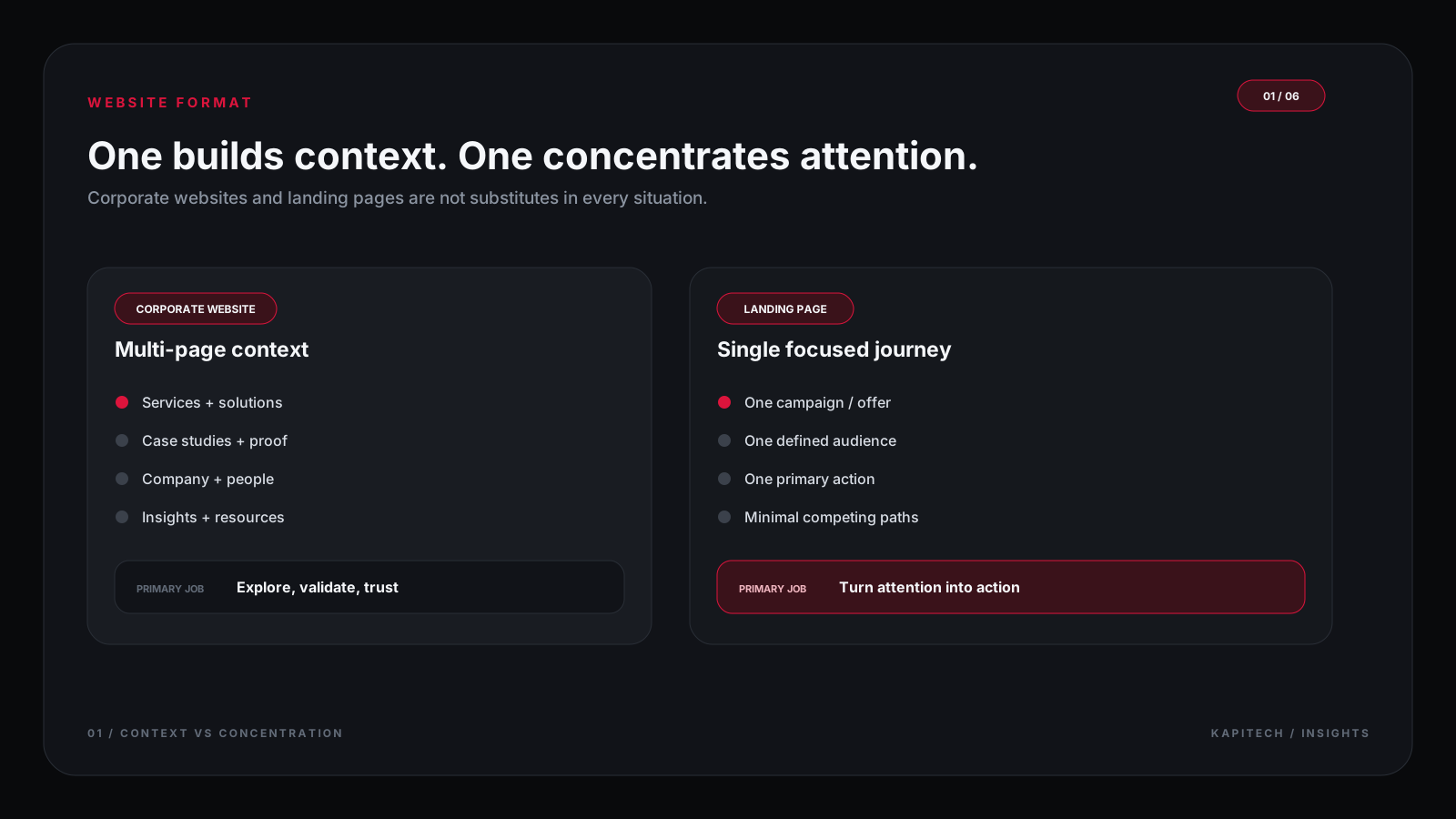
A corporate website and a landing page can both generate leads, but they are designed around different visitor needs. A landing page focuses attention on one offer or action. A corporate website supports broader exploration, from understanding the company to comparing services, reviewing proof, and deciding whether to make contact.
The choice should follow the visitor's starting point and the questions they need answered. A page that is too broad can dilute a campaign; a page that is too narrow can leave a B2B buyer without enough evidence to trust the business.
Article key takeaways
The ideas worth carrying forward.
- A landing page concentrates attention around a specific audience, offer, and action.
- A corporate website helps visitors explore services, proof, company information, and multiple next steps.
- Traffic source and visitor awareness should determine the amount of context and navigation provided.
- A strong hybrid approach connects focused campaign landing pages to a credible corporate website.
- The best structure is the simplest one that answers the visitor's questions and supports the business goal.
Corporate website vs landing page at a glance
Swipe to compare
3 columns| Dimension | Corporate website | Landing page |
|---|---|---|
| Primary job | Explain the business and support several visitor journeys | Support one focused campaign, offer, or action |
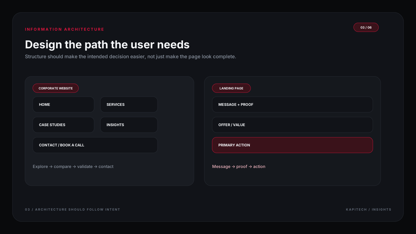
| Navigation | Usually includes section or page navigation | Often reduces distractions around the main action |
| Content depth | Services, proof, company context, resources, and details | The minimum context needed for one audience to make a decision |
| Traffic | Branded search, referrals, direct visits, research, and campaigns | A specific campaign, ad group, email, event, or offer |
| Success signals | Qualified inquiries, relevant exploration, trust, and assisted conversions | Completion rate, lead quality, and campaign economics |
The job each format is designed to do
A landing page reduces the distance to one action
Landing pages work well when the visitor already has a clear context: a product offer, campaign, event, or service. The page should state who the offer is for, what problem it addresses, what the visitor receives, why it is credible, and what to do next. Every extra element should help that decision.
A corporate website supports exploration
Corporate websites serve visitors who need to understand more before they act. They may compare service capabilities, read case studies, review leadership information, look for technical details, check locations, or share a page with other decision-makers. Navigation is useful when it reduces uncertainty rather than merely listing pages.
Traffic source changes the required context
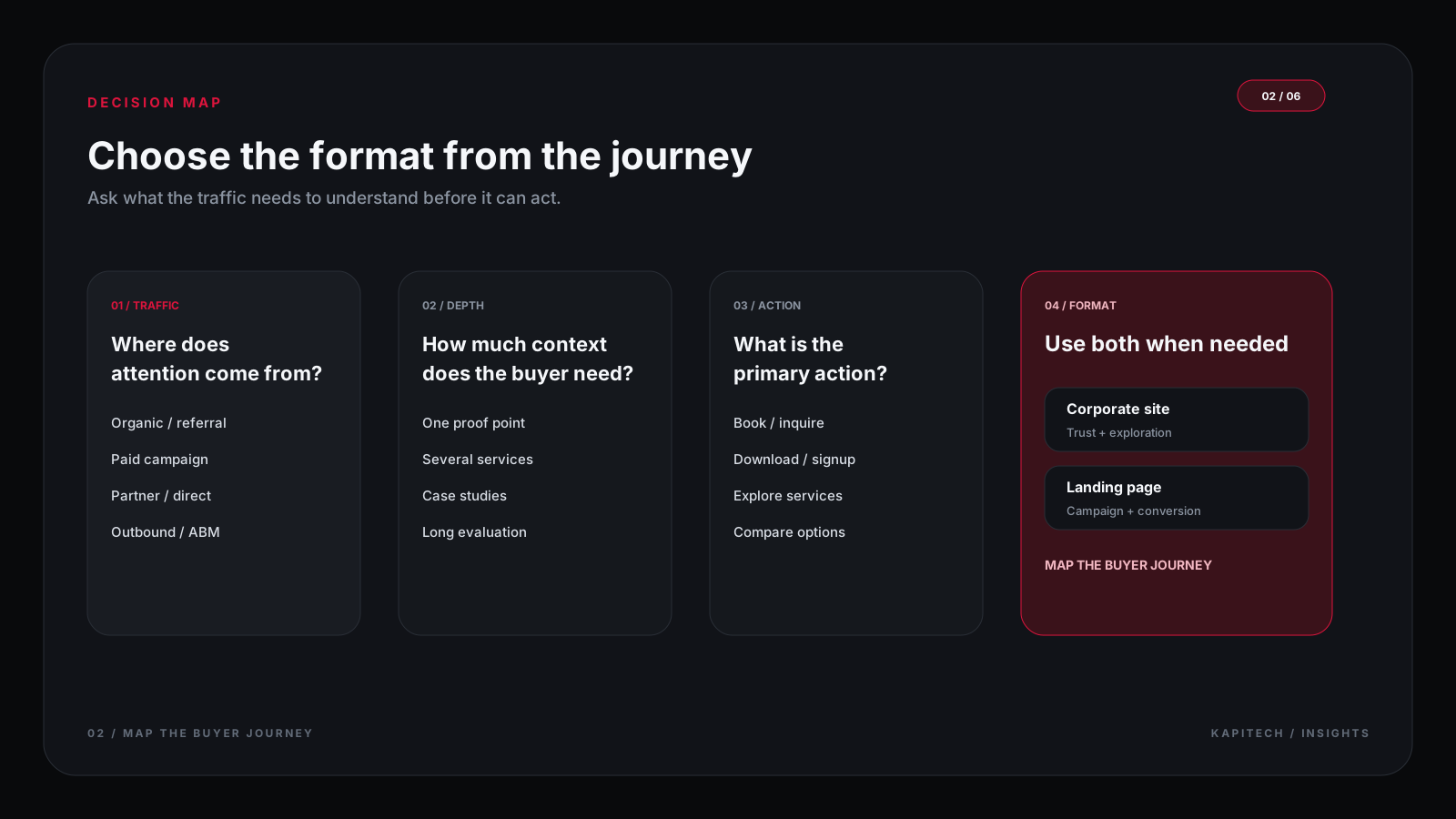
A warm referral may already understand the company; a paid search visitor may need a precise answer immediately. A high-intent campaign page can stay focused, while a broad service or branded page usually needs more context and supporting evidence.
Match the structure to the buying journey
Define what the visitor knows before arrival
List the questions a visitor is likely to bring from search, advertising, referrals, or an email. If the visitor still needs to understand the category or problem, the page must provide that context. If they already know the offer, the page can focus on evaluation and action.
Give complex decisions enough evidence
B2B purchases often involve several people and a longer evaluation. Capabilities, relevant case studies, process, constraints, security expectations, and implementation details may be necessary. Removing all navigation to force a conversion can make the decision less trustworthy.
Make the next action feel proportionate
A visitor who is still researching may prefer to read a case study or compare options. A visitor with a clearly defined requirement may be ready to request a consultation. Good information architecture provides a sensible next step for both without making every page compete for the same CTA.
A hybrid model is often practical
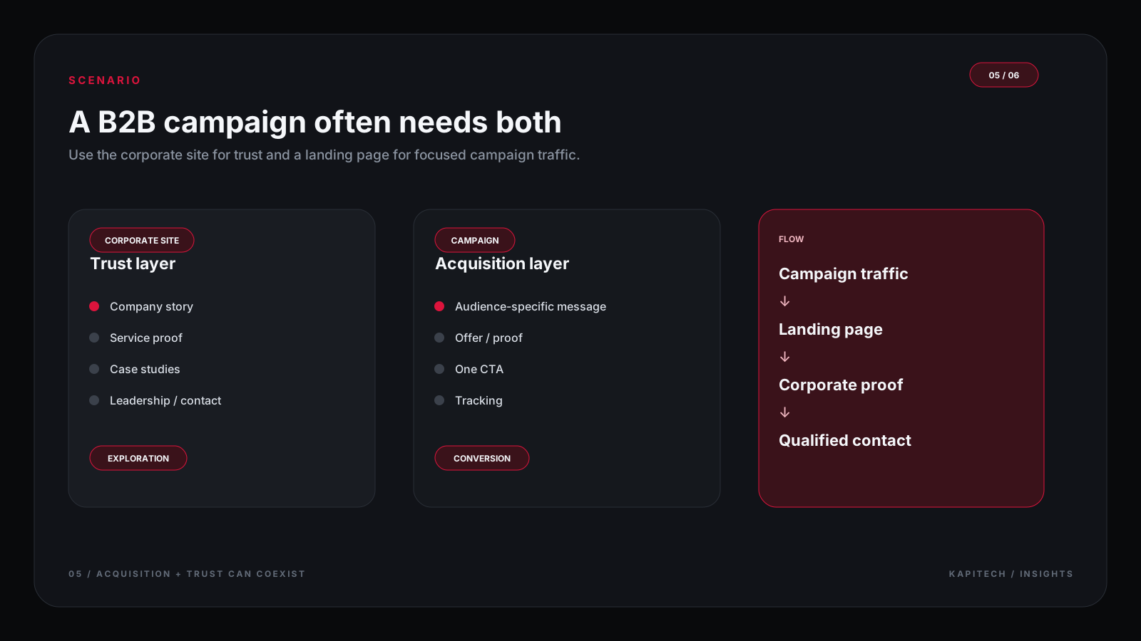
A corporate website can provide the source of truth for the brand, services, case studies, and resources. Focused landing pages can then support specific campaigns without duplicating the whole site. They should link to deeper information where it helps the visitor, and they should use consistent claims, visuals, and contact paths.
Keep campaign pages connected to credible proof
If a page makes a claim about expertise or results, give visitors a way to inspect the supporting evidence. This could be a relevant case study, methodology, testimonial that has permission to be published, or a clear description of the process. Avoid claims that cannot be substantiated.
Common structure mistakes
- Building a full website when the immediate job is a single campaign offer.
- Using a one-page landing page to explain a complex service with multiple stakeholders.
- Hiding essential proof, pricing context, or limitations to make a page look shorter.
- Sending paid traffic to a general homepage with no message continuity.
- Creating duplicate pages that make different promises for the same offer.
- Using multiple competing calls to action without a clear priority.
- Measuring clicks without checking whether the leads are qualified.

Before choosing a format
Website format checklist
- The target audience and traffic source are clear.
- The main question the visitor needs answered is documented.
- The primary conversion action matches the visitor's intent.
- Required evidence, service detail, and limitations are available.
- Navigation is included or removed for a deliberate reason.
- Analytics measure qualified outcomes, not only button clicks.
- The page connects to the wider customer journey without duplicating content unnecessarily.
Conclusion: match the website to the job
Choose a landing page when one audience, one offer, and one action define the task. Choose a corporate website when visitors need broader exploration and proof. Combine them when the business needs both campaign focus and a credible, well-structured place for deeper research.